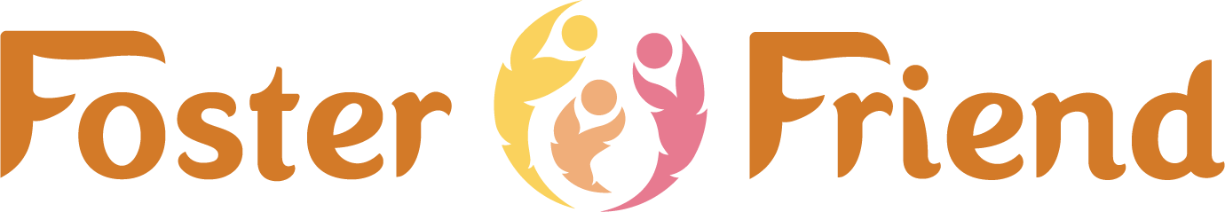
FOSTER FRIEND
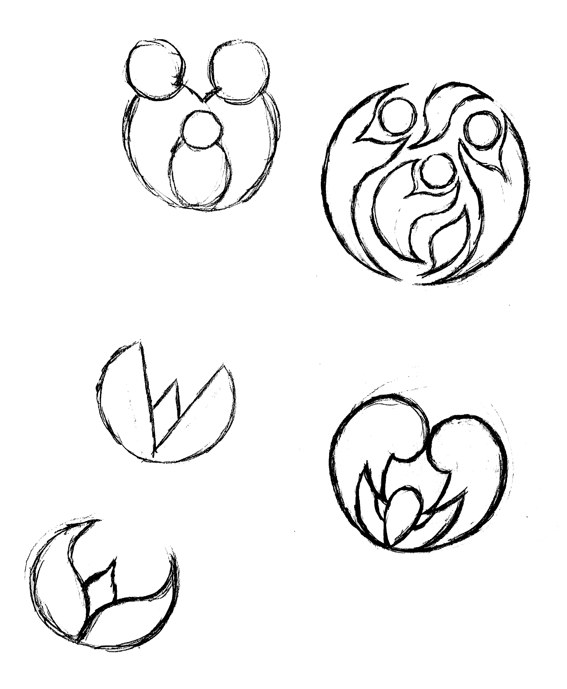
Icon Ideation
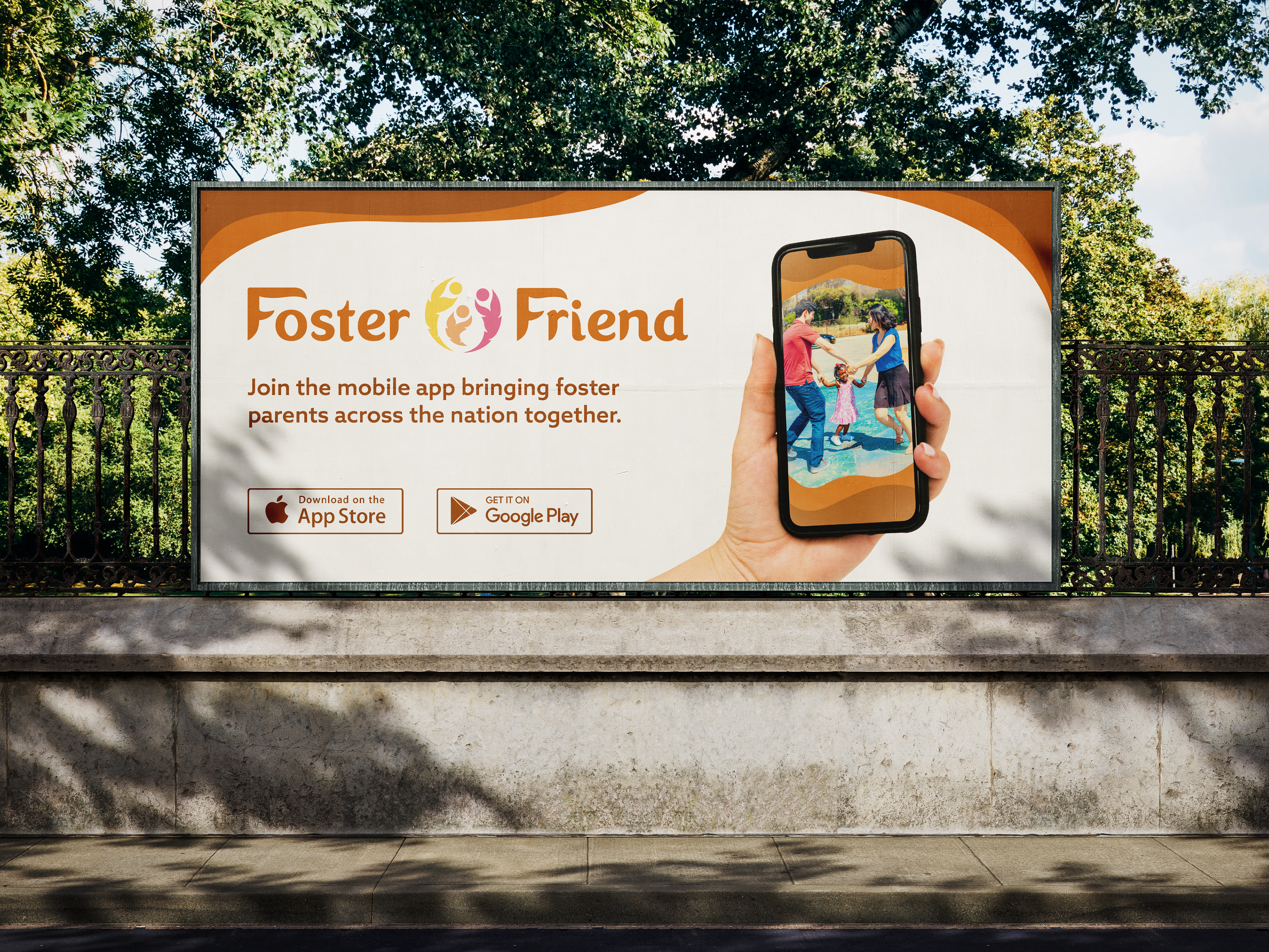
Billboard Mockup
Poster Mockup
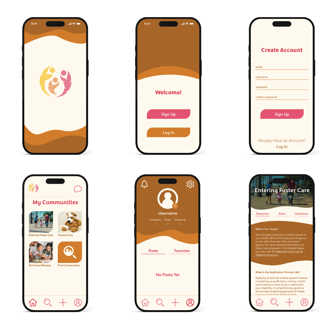
iPhone Mockups
Final Logo - Square Orientation
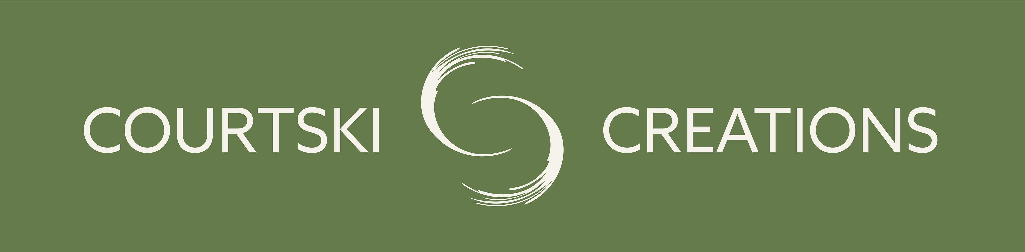
Final Logo - Wordmark
Final Logo - Horizontal Orientation
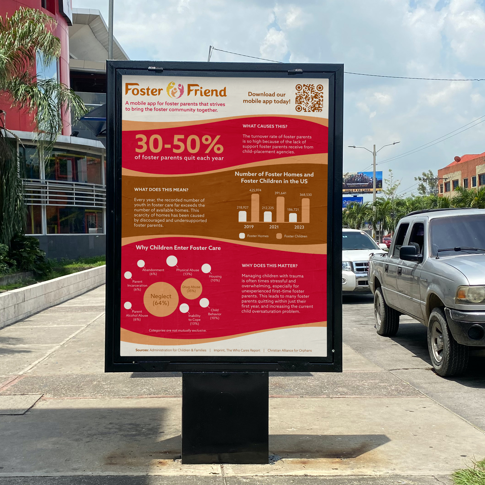
The goal of this project was to craft a visual identity for Foster Friend, a mobile app dedicated to supporting the foster care community. Researching the foster parent demographics, I decided to target the female audience, so I chose colors that are associated with femininity, warmth, and enthusiasm. For the logo, I crafted an icon that represented an abstract family with a leafy appearance to lean into the nurturing aspects of the identity. The wordmark was carefully revised to pair well with the icon, with thick swirly shapes with sharpened points. The mobile app, poster, and billboard were given a similar treatment, using the same swirly shapes and bright colors.
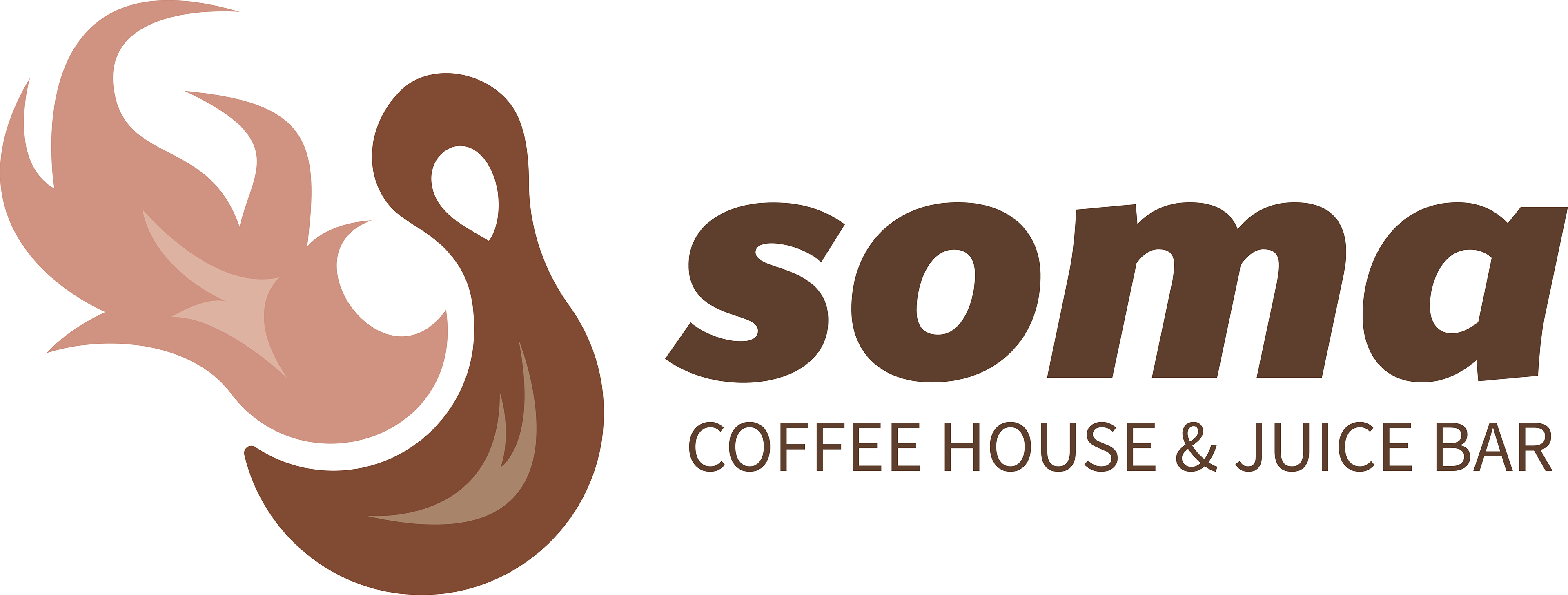
SOMA
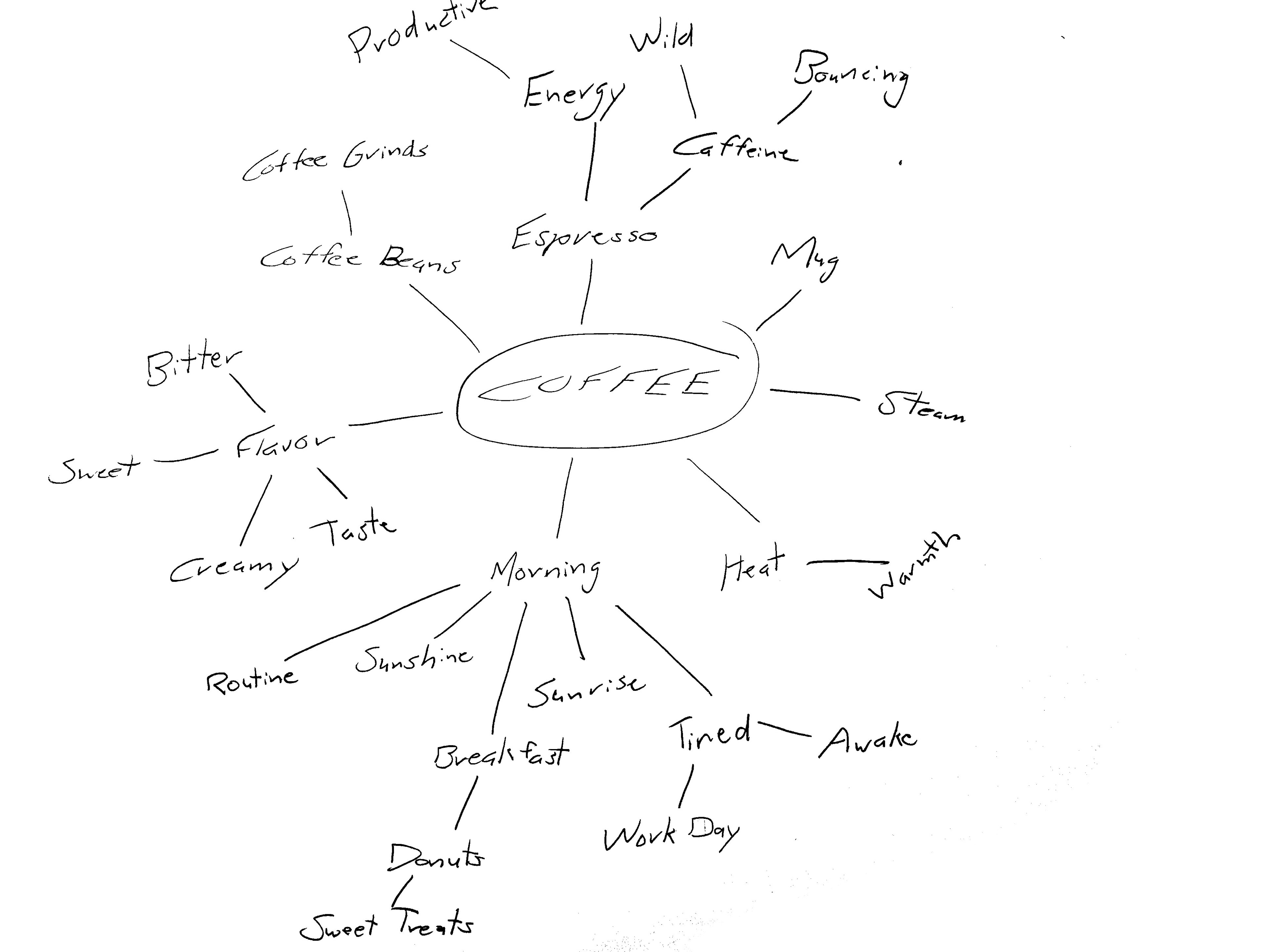
Mindmapping
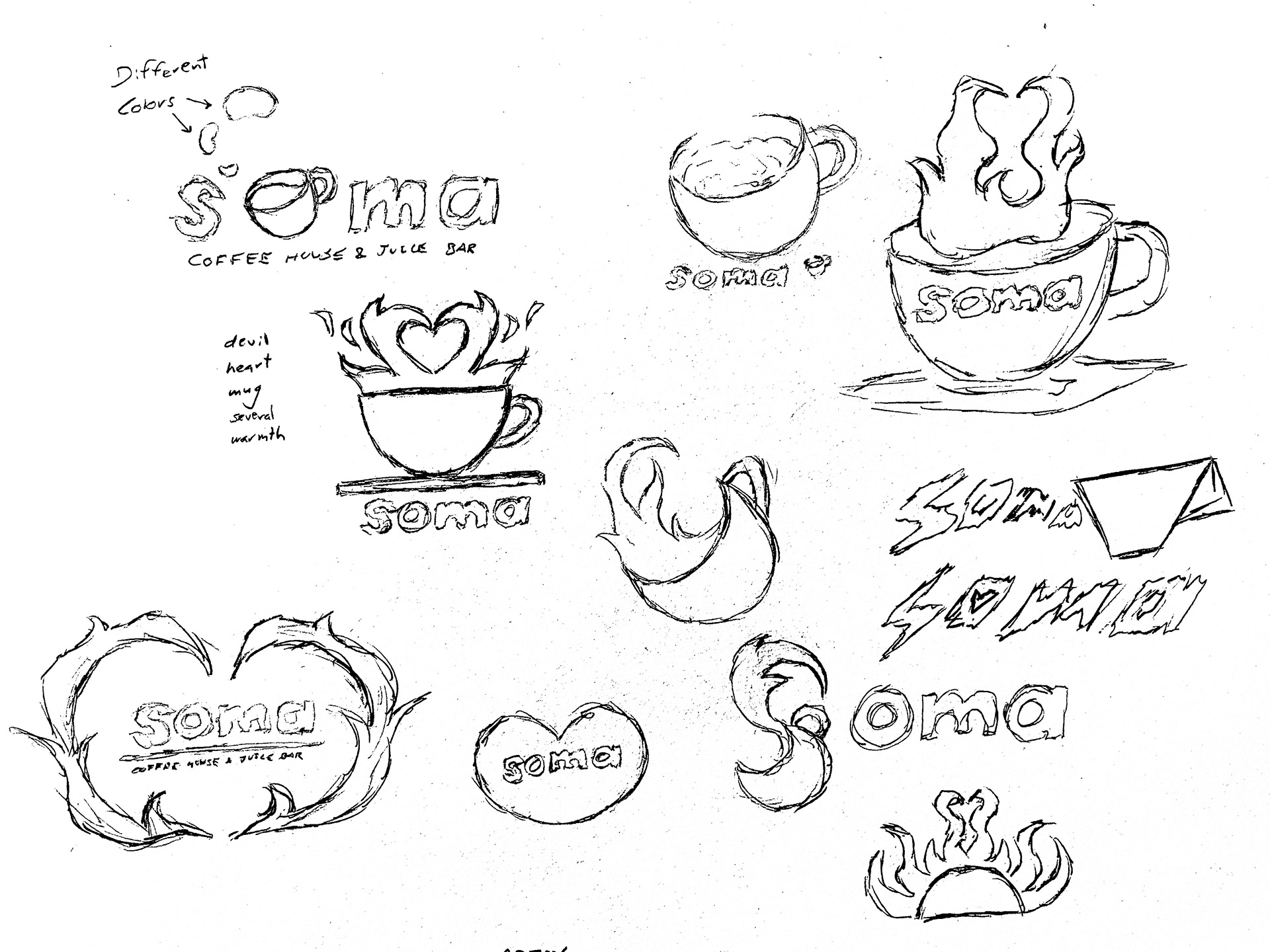
Icon Ideation
FInal Icon
Final Logo
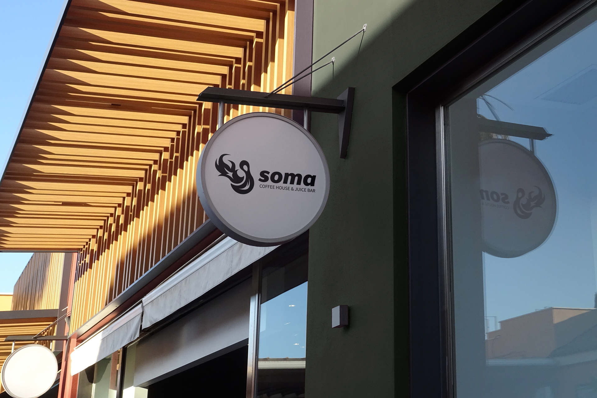
Business Sign Mockup
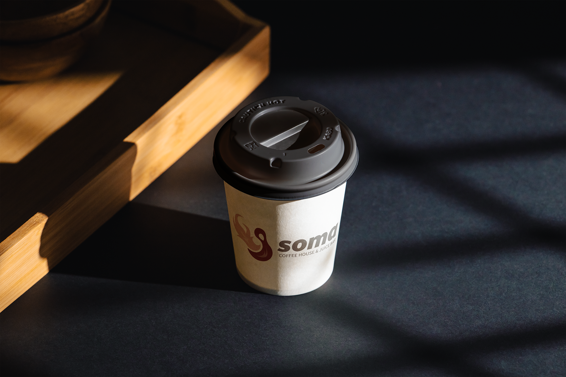
Coffee Cup Mockup
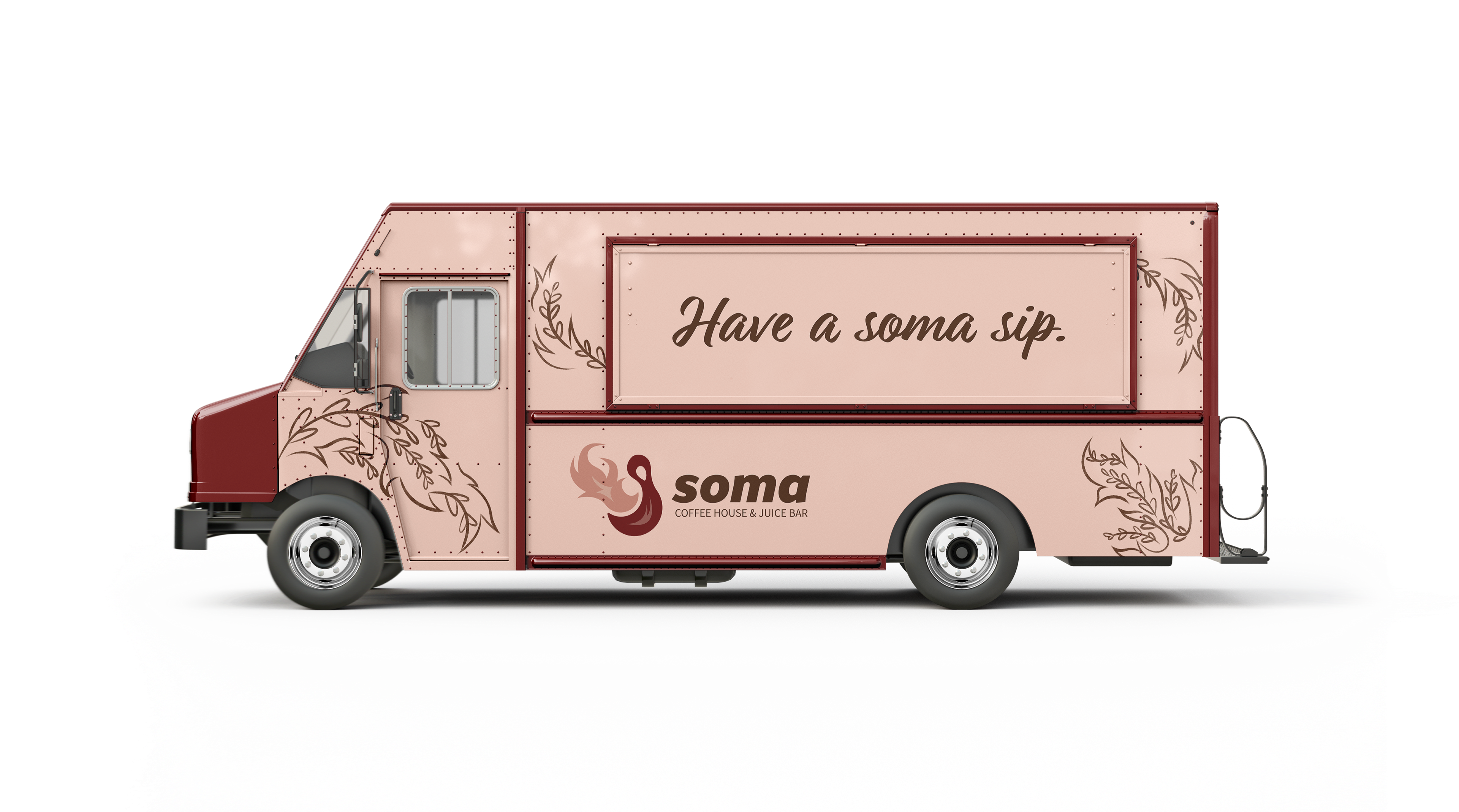
Food Truck Mockup
The goal of this project was to redesign the logo and refine the visual identity of Soma Coffee House and Juice Bar. I began by mindmapping to find the appropriate direction for Soma's identity. With that information, I began crafting a variety of concepts, choosing a fiery coffee that best represented the chaotic and welcoming aspects of the business. I chose warm colors for the color palette to reinforce the welcome aspect. On the food truck, the logo was paired with floral decals, shaped similarly to the fire in the logo icon and representing one of the store locations that has a strong floral theme.
BUZZTECH
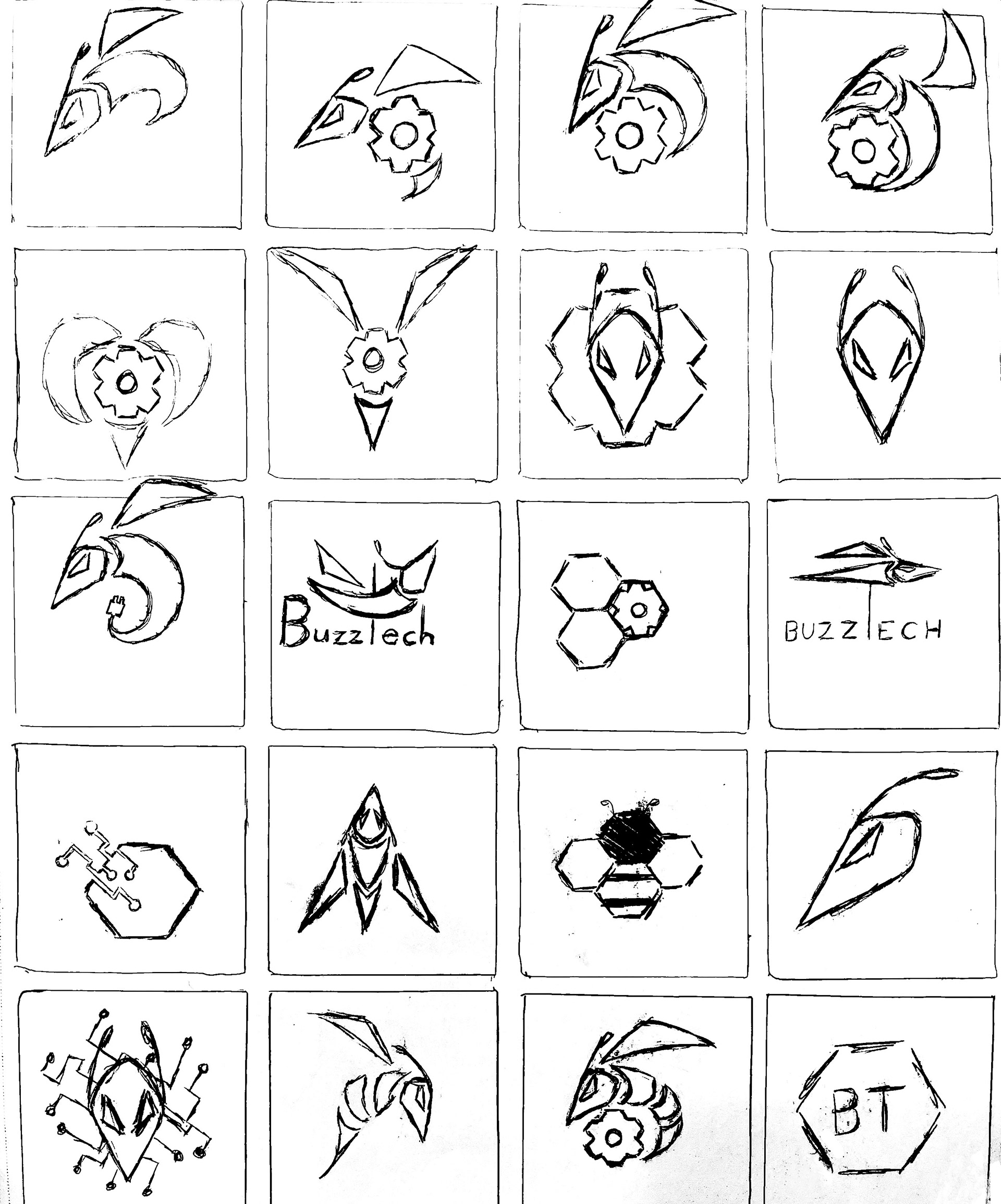
Icon Ideation
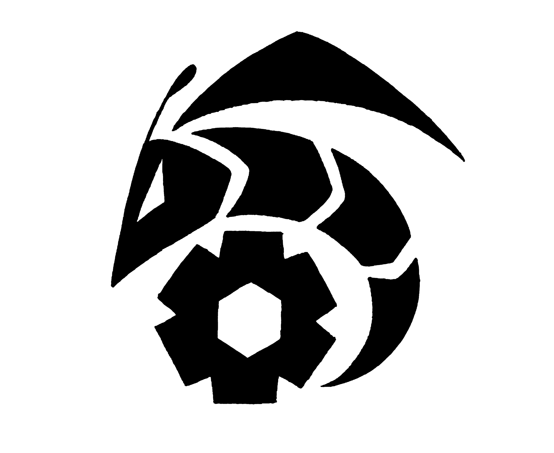
Final Logo on Paper
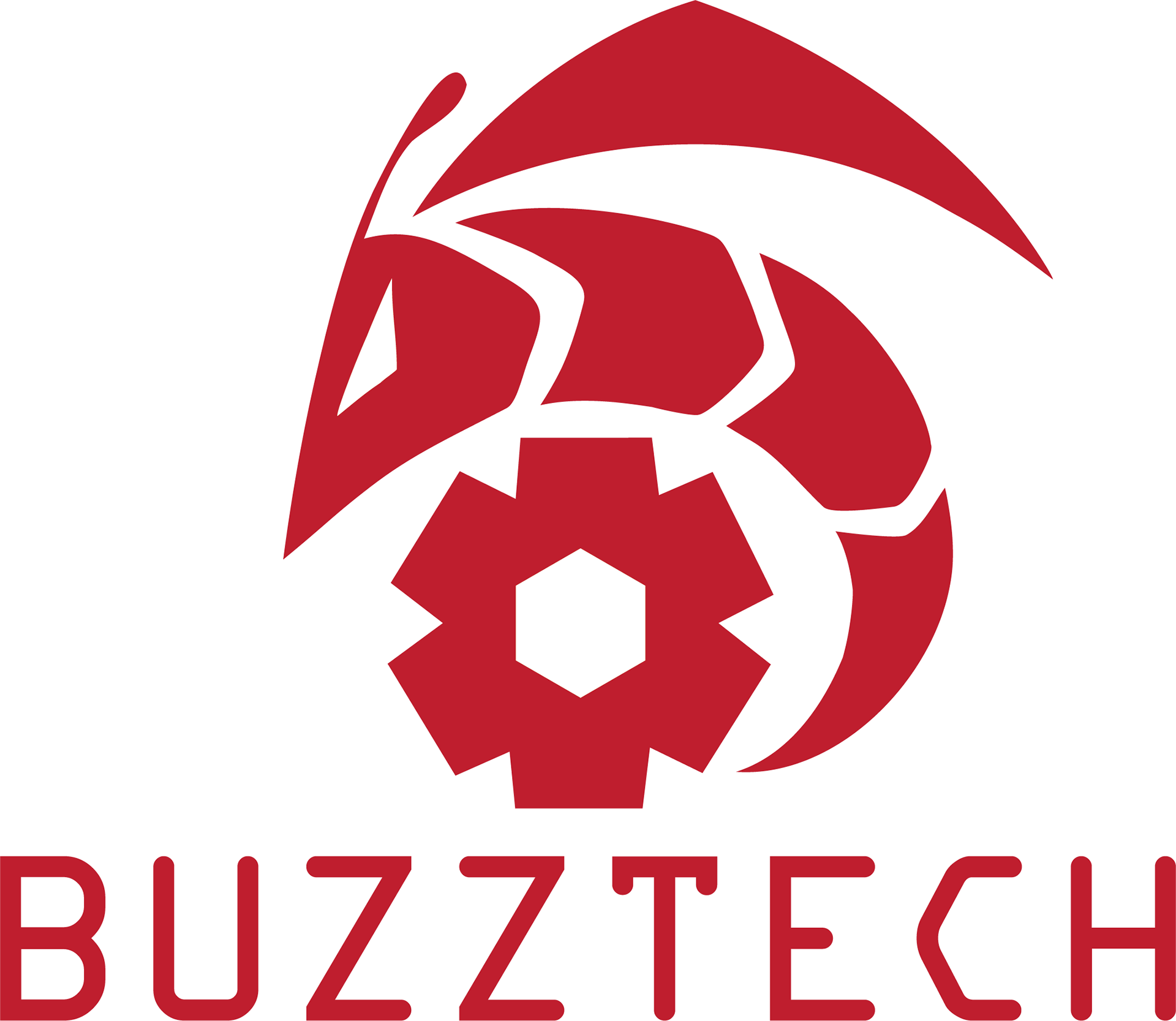
Final Logo
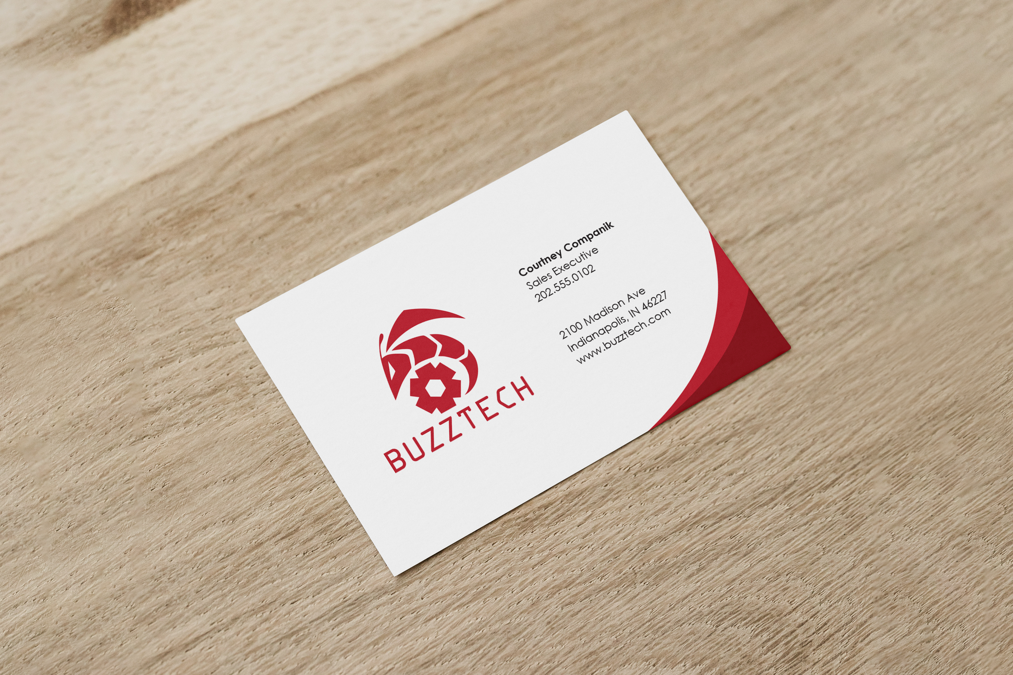
Business Card Mockup
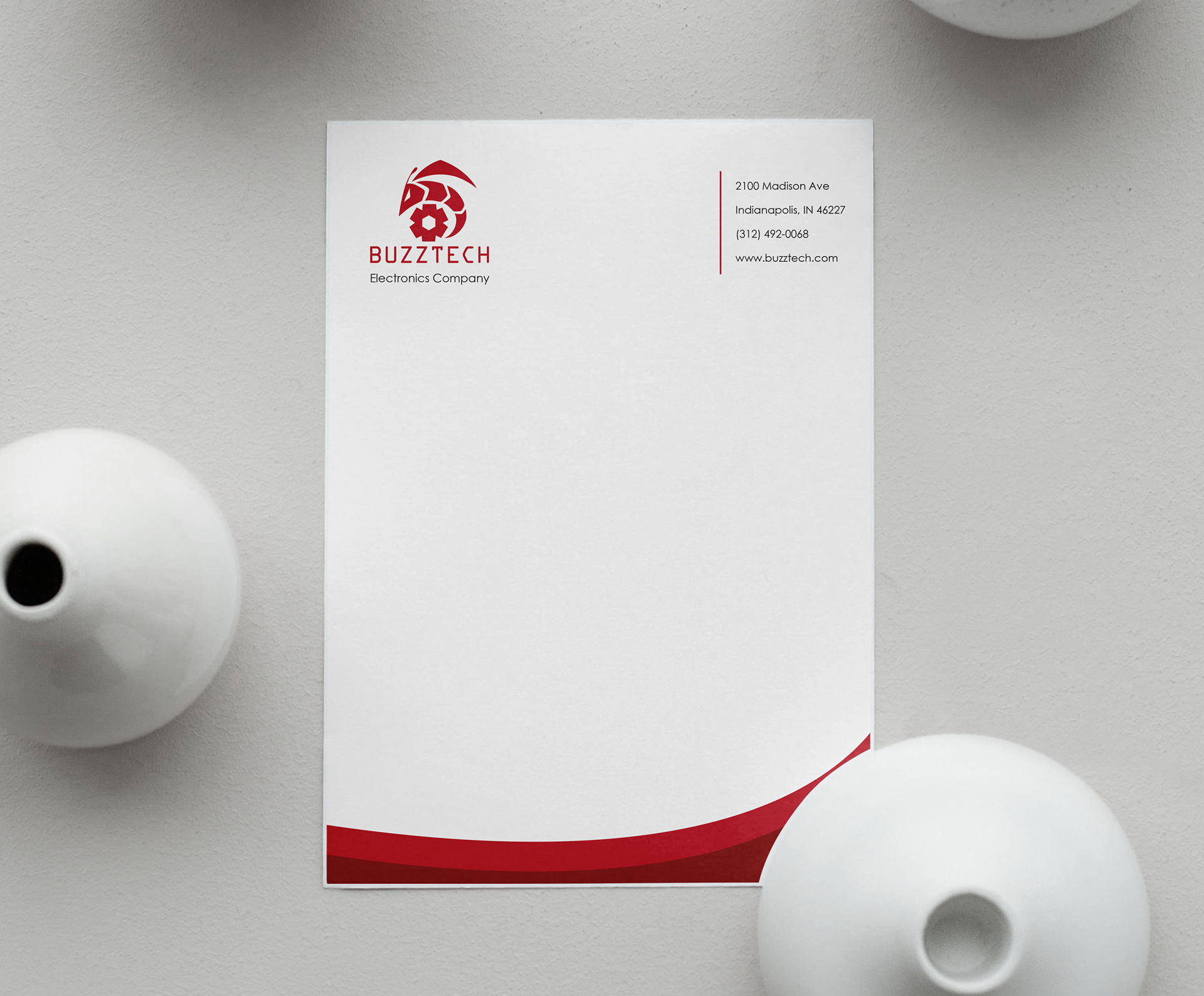
Letterhead Mockup
The goal of this project was to design a logo for the BuzzTech electronics company. Additionally, the logo was to be applied to two business documents: a business card and a letterhead. My goal for the BuzzTech company logo was to demonstrate the power and speed of the company's products, so I decided to use a vibrant red color palette. With a gaming–focused audience in mind, I used bold and sharp shapes in my logo design. The elements I incorporated into my design successfully give off the swift and feisty tone I intended for BuzzTech.